
2022 Topps Factory Set Review

Despite having yet to see a single pack of Topps series two in the wild, I stumbled upon the 2022 Topps Factory set in my local Target last week. It was a pleasant surprise as I figured I'd have to end up ordering one from the Target website, or worse yet, over paying on the secondary market for one. Instead, I found myself sorting out the cards by number and paging them all up in a binder last Sunday evening.

This marks the third year in a row and the fourth time in six years I've gone the factory set route. I think this trend will continue. It's just too hard to find packs of cards in stores, and the rare occassion I do, it's just extremely costs prohibative to try to build the set by hand. The packs have gotten way to expensive, they're over stuffed with inserts, and I end up pulling too many duplicates. And now, unfortunately, the insert fad/trend/gimmick has found it's way into the factory set as well.

These cards were stuffed in with the set. The sealed bag are five "rookie photo variations," or something stupid like that. Just pick a photo and go with it Topps. The oil slick plastic one is a "Topps Chrome." I don't consider "Chrome" to be a baseball card. It's too thick, too plastic like, and you can literally see the indentation in the material around the player. It's more like a little plaque or something. On top of that the prism effect completely detracts from the photography. All in all, it's crap. Which is another way of saying I'll be putting these on eBay to see how much money someone is willing to waste on it. I do after all have vintage set builds to finance.

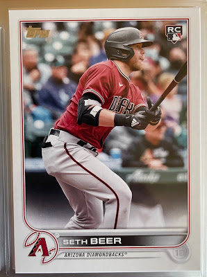
Topps wasn't done with the factory set gimmicks yet. I was more than a little confused when I began sifting through and sorting the final stack of cards I had in the 600's. There were two copies each of card numbers 558, 559, and 600. It took me longer than it should have, but I figured out three of them were player variations. I don't think Topps appreciates just how annoying this is to a large demographic of their collectors who have been building their sets for the last three or four decades. Either put a guy in the set or don't. This appears to be nothing more than a money grab to go after the people who already over paid building a set through purchasing packs. I remember when Topps started doing this with retired players. I sort of liked that. It was fun to see Willie McCovey on a modern design and I felt sense that the set was incomplete without them. These are current players though. I don't want to have to debate whether the set is "complete" without them. For record, it absolutely would be.
One final complaint before I move on to the good stuff, because all in all, I do think 2022 is a very nice looking set and Topps deserves a lot of praise for once again delivering a product people want to collect and sleeve up in 9-pocket pages to save in perpetuity. However, the card backs don't align. I realize this isn't a new trend and goes back to the early days of Topps (I'm currently in an on-going debate as whether to line up the card fronts or backs with the '54 set I'm slowly building) but it's a tradition I'm okay leaving behind. Bring back gum if you want to go retro, not misaligned card backs.

Due mostly to a lack of effort and a desire to get this post out quickly, I've decided to run down 22 cards from the 2022 set that I like. I'm not saying they're definitively my 22 favorite cards, or suggesting these are in any order, it's just 22 cards I'm showing with varying degrees of comment. Feel free to disagree, and I have no problem admitting that I probably over looked a few, but if nothing else this should give you a feel for the set.
22 Cards From 2022 Topps That I Like

#22 Shohei Ohtani (Batting) - Forgive me for being one of those baseball fans that doesn't think what Shohei is doing the most magical thing to ever happen. It's cool, and he's great, but I'd be slightly more impressed if the Angels weren't thirty games out of first. That said, I love the way Topps handled it. One card with hitting stats to start the set with card #1...

#21 Shoehei Ohtani (pitching) - ...and one card with his pitching stats to end the set. (This is the "real" 660, not Bob Witt's kid)
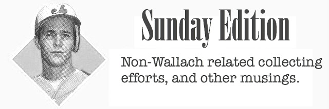
#20 Justin Upton - I feel like Topps went a bit heavy with throw back uniforms in this set, but when the uniform looks as nice as the old California Angels uniform, who am I to complain. I also like that the Angels went with the true pullover and not the faux button down throwback.

#19 Joe Ryan - (I may go a little heavy with throwback uniforms in my list as well) This is a rookie card young Mr. Ryan can be proud of. Just a great looking baseball card. Powder blues need to become the norm again.
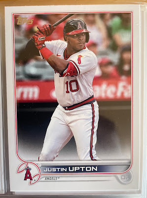
#18 Fernando Tatis Jr. - I've tried to be a Tatis fan, but he's making it nearly impossible.
That doesn't mean I need to turn a blind eye to a nice looking card. Jose Canseco had a lot of great looking cards too. Hopefully Feranando can get his act together and figure things out. Strong 1973 vibes with this card and a lot of others in the set.
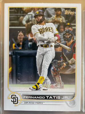
#17 Manny Machado - If there's been a winner in the Tatis drama, it's got to be Manny Machado. Seems like a long time ago that he was getting dragged (rightfully) for not running out balls and other juvenille mistakes. I typically don't like horizontal cards but this one (while no '71 Munson) is an exception to the rule.

#16 Mark Kolozsvary - While I feel like there are fewer cards of catchers in their gear, there were a few nice ones in the set. I'm going with this one as my favorite. This is another rookie card that I'm sure the player's friends and family will all be very pleased with.
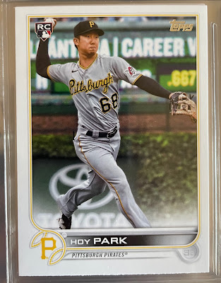
#15 Hoy Park - Topps did a lot of favors for a lot of guys with great photos on their rookie cards this year. Dwight Gooden's kids (or grandkids at this point) are probably looking at stack of '85 Topps and shaking their heads.
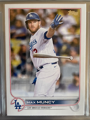
#14 Max Muncy - There were a good number of shots on cards of bats being tossed. I don't remember when this trend started with Topps photographers, but I like it. If we can't have photos of players loitering around the batting cage any more, at least we have these.
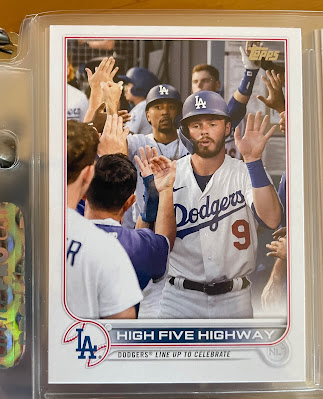
#12 "High Five Highway" - All this card needs is a white cloud around it and the team leaders on the back and it'd be right at home in '88 Topps.
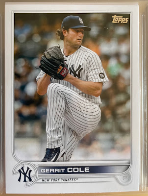
#11 Gerrit Cole - This is just a great steak and potatoes example of a baseball card. There are a ton of cards in the set of pitchers in their wind up like this and as a kid who suffered through the 80's when most pitcher cards were just rejected DMV drivers license photos, this is a nice development.

#10 Valdimir Guerrero Jr. - Not favorite to end up there, but this card is in the running to be the spine card in the set's binder.
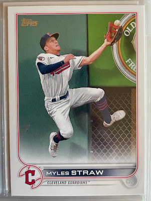
#9 Myles Straw - This is just a great photo, would have been right at home in the 1989 Upper Deck set. I'm inclined to cut out a picture of a shark to glue onto the card and mail it off to Beckett, though I'm not sure if they're still running that feature.
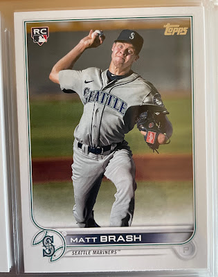
#8 Matt Brash - As mentioned above, Topps did a lot of rookies a lot favors with the photo selections on their cards. Matt Brash is not one of those rookies. They did him dirty.
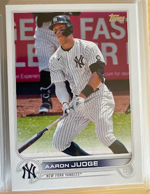
#7 Aaron Judge - I'm not going to sit here and argue "61" is the home run record, it isn't. I remember watching it be broken on live tv. That said, it's still an undeniable bench mark, like hitting .400. This is a cool card to be the one being pulled from packs during the summer Judge is making a run at 61.
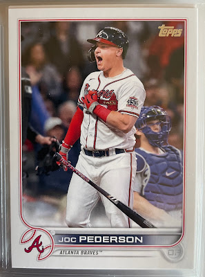
#6 Joc Pederson - I've long been a big Joc Pederson fan. This is very nice card of Joc and has a chance to end up as the one I use as the "spine card" in the binder. My only reluctance is that he's playing for the Giants this year, so it feels odd to use a 2022 card of him as a Brave.
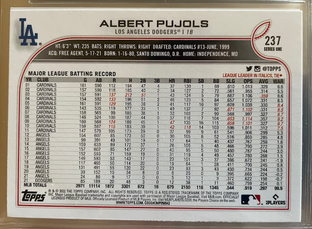
#4 Albert Pujols (back) - I love a card back of a long time veteran. I can remember being fascinated by the backs of cards of guys like Tommy John, Ted Simmons, Rod Carew, and especially Pete Rose as a kid. Topps takes a lot of criticism for a lot of things, but it deserves to be pointed out when they do something right. Keeping full career stats on the backs of cards is one of those things they get right year after year.
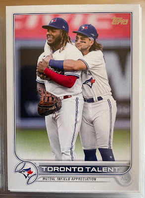
#3 "Toronto Talent" - This card has huge 1987 and 1988 Topps team card vibes. I miss the old subsets of the 1980's and like to see Topps bring them back in a meaningful way. For now, this card will suffice.
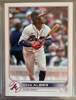
#2 Ozzie Albies - This is the current clubhouse leader to be the card I use as the spine card. I like the photo, feel like it compliments the design well, and it's a card of a team coming off of a World Series win.
.JPG)
#1 Brett Gardner - I'll be the first to admit this isn't the best looking card in this set. As I've mentioned, I'm not even particularly fond of the horizontal cards. But this is what I (and others) call a "bookend card." A final card for a guy that had a great major league career, even if it's not one anybody is ever going to confuse for a Hall of Fame Career. Topps used to do these for the guys who appeared in their sets for a decade plus, and then stopped in the mid 90's. Just in time to omit Tim Wallach from their 1996 and 1997 sets. As a result, there is no Topps card that shows Tim Wallach's full career stats (Collector's Choice nicely did so with their 1997 Wallach). Gardner has been one of, if not my favorite player, in the majors since the Yankees brought him up in 2008. This card nicely immortalizes his time in the majors, and I'm glad Topps chose to include him in the set, even if it was done with the belief he may still be showing up in Yankee lineups this year.

The upside down backs in 1954 make sense when you see the press sheet (only way to do bleeds and common cuts the way Topps designed things—whether that choice was wise is definitely arguable). They make zero sense in recent years, especially on a set like this on where there are no bleeds at all. So all I'm able to conclude on that front is incompetence.
ReplyDeleteVariations are definitely not part of the set ... The Myles Straw is in my top 3 for best 2022 Topps card.
ReplyDeleteWhat's going on with the Judge card? Doesn't appear to be from game action considering there's a Yankee in the background in shinguards and a sweatshirt. A practice swing before entering the batting cage?
ReplyDeleteI love Brett Gardner, and I'm glad he can go out with a cardboard bang.
ReplyDelete